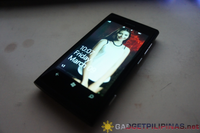
If there is one word that can describe this phone or probably a word that captures its essence, that would be ‘Beautiful’.
Ladies and gentlemen, you are about to read Gadget Pilipinas’ exclusive review of the Nokia Lumia 800, the first child of the marriage of Nokia and Microsoft – the first true Windows Phone.
What can I say – the Nokia Lumia 800 is a wonderful device. It may not be packed with powerful innards but this undoubtedly looks very professional just like its long lost brother, the Nokia N9, which we reviewed a month ago. Its operating system may not be that “open”, compared to Google’s Android, but its definitely one of the easiest to use and navigate.
The Nokia Lumia 800’s LOOK
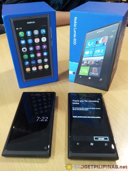
This isn’t Deja Vu. What you are seeing is not the Nokia N9, but the Lumia 800. Yes, the latter borrowed 90% of its look from the Nokia N9. Nokia didn’t simply remove the Meego OS from the body of the N9 and fused it with Windows Phone 7.5 in it. They realized that the N9 still has some design imperfections, so they modified its body to make its functions even more convenient for the end user and to suit the operating system. That is actually redefining perfections to provide blissful experience for end-users; another way for Nokia to connect with ‘people’.
Gallery (Side by side comparison with the Nokia N9):
[nggallery id=1]
Notable differences from the Nokia N9 include the following:
1. Dedicated physical camera button.
2. Capacitive/Touch Sensitive buttons (These buttons basically made the Lumia 800’s screen smaller than the N9 by .2 inch or 5.08mm).
3. Lumia 800 lacks a front-facing camera.
4. The LED flash is placed directly above the Carl Zeiss lens.
Gallery:
[nggallery id=4]
The Windows Phone 7.5 Mango
Let me first discuss about the OS, then Lumia 800 with the OS.
Windows Phone 7.5 (Mango) embodies the new philosophy of Microsoft that concerns providing the best mobile phone experience. The overall design of the new mobile OS of Microsoft, to me, simply implies one thing – Touch is all that matters. Yeah, that reminds me of David Pomeranz’s song. Suddenly, with Windows Phone 7, seeing touch controls and tapping them felt like a different experience.
The latest iteration of the Microsoft’s mobile operating system heavily uses Live Tiles in its Metro User Interface (UI). This is the same UI that Windows 8 currently have. Simplicity and Zen are ever present in the Windows Phone 7 UI; a design philosophy that most people associate with Apple.
[stextbox id=”info”]
Taken from MSDN:
The Application Tile is the Tile created when a user pins an application to Start by pressing and holding the application’s icon in the Applications List. Tapping a pinned Application Tile navigates the user to the application’s opening page.
A secondary Tile is created programmatically by an application based on interaction from the user. Typical uses for a secondary Tile include a weather application that pins a Tile to Start for each city that the user wants a weather report for, or a news application that pins a Tile to Start for each type of news that the user would like to see – World, Local, Sports, and so on. The application’s code provides the Tile with launch parameters to customize the navigation destination of the Tile. For example, tapping on a secondary Tile pinned from a weather application might open the details page for a particular city. That Tile might also have weather details for that city displayed and updated live on the Tile.
[/stextbox]
Combine this OS with the beauty of Nokia Lumia 800, then we would have a simple yet beautiful tactile phone experience. This is the main reason why this Lumy is indeed the first true Windows phone. My experience with this phone incomparable compared to using iOS and Android devices. Everthing seems to be so accessible in a jiffy.
What’s even more exciting about this OS and this phone is the integration of Xbox Live. This means that if the Live account you initially associated with this phone is connected with your Xbox Live account, the OS will pull all your Xbox Live data – friends, requests, game achievements, profile and even your avatar. If you downloaded a game from the Marketplace, you can only find the downloaded games inside Xbox Live. I thought that it’s a neat and convenient way to separate the experience of getting entertained by your games from other experience you can gain from other applications.
The Messaging feature of this phone reminds me of Nokia N9’s and N900’s Conversations integrated application. More over, with the ‘Me’ Live Tile feature, you can check in, update your status and post a message to all your linked Social Networking accounts without having to go through switching from one app to another.
Gallery (Windows Phone 7.5 Mango):
[nggallery id=3]
Not everything is great on this phone though. I find the battery of this phone kinda sucks because it died out in less than 24 hours with moderate usage, occasional 3G and Wifi connection, sms exchanges and 10 minutes total call time.
Also, even if this phone is packed with an 8 megapixel Carl Zeiss lens, the actual output are mediocre compared to the photos taken by my Samsung Galaxy Note. Take a look at some sample shots below.
Sample Shots:
[singlepic id=47 w=512 h=384 float=center]
[singlepic id=48 w=512 h=384 float=center]
[singlepic id=49 w=512 h=384 float=center]
[singlepic id=50 w=512 h=384 float=center]
[singlepic id=51 w=512 h=384 float=center]
Will You Buy One?
In December 2011, I bought a Samsung Galaxy Note. I love it and so far; it’s one of the best phones I’ve used next to the iPhone 4s. I told myself, “I’d never sell this baby until the iPhone 5 becomes available.” Things changed when I got my Nokia Lumia 800 in February 2012. Suddenly, the Lumia 800 becomes “far superior” than my Galaxy Note – even though reality dictates otherwise. How twisted is that for Nokia and Microsoft to change my outlook so easily!
The overall experience that the Lumia 800 gives is something worth keeping. The operating system is so engaging and enabling – it somehow tells me to get hold of my phone all the time and use it. Yes, the phone has bearable imperfections and occasional jitters but that’s how technology works – imperfect, not impervious to flaws. That’s why software and hardware companies always push fixes and updates.
Change is hard, I know. You’re now probably comfortable with Android and iOS, and the phones associated with the mentioned OSes. However, isn’t it that “fear, uncertainty and discomfort are your compasses toward growth”? You decide.
Giancarlo Viterbo is a Filipino Technology Journalist, blogger and Editor of gadgetpilipinas.net, He is also a Geek, Dad and a Husband. He knows a lot about washing the dishes, doing some errands and following instructions from his boss on his day job. Follow him on twitter: @gianviterbo and @gadgetpilipinas.


