I am involved in wire-framing and developing websites. I help companies come up with websites that conform to web standards and trends. While working on a project for an insurance company, I was requested to look for visual pegs, which can be used as reference to point out what’s wrong with the existing website. But I wasn’t just particular on how it looks; I was very particular in looking for trends that will stick and will be very efficient for both the company and for end-users.
Prior to my search, I listed down several criteria:
- Ease of use/Navigability
- Minimalist Vibe
- Engagement-Friendly
- Social Media Centric
- SEO Friendly
- Considers Multiscreen/Fluid Layout
I had several thoughts in mind prior to my church.
- La Salle: I thought that La Salle’s website is neat and true to its brand. But it doesn’t use mobile stylesheets (css). So if you’re going to visit this site using your smartphone, the best thing you could do is to change your phone’s orientation to landscape.La Salle’s website is great on SEO. And they have maximized the use of Social Media.

Country Web Rank: 332; Website Grade: 59/100
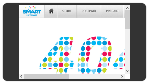
- Smart: Smart’s website is packed with information. It shows a minimalist vibe and it looks good on my tablet. But similar to La Salle’s website, Smart’s website was not made with smartphones fully in mind. Yes, the icons are big enough to be clicked even on mobile phones, but it’s required for mobile phone visitors to pinch out (zoom out) to fully see the site on vertical orientation.43% of all phones are smartphones, and 87% of smartphones users access the internet. Unfortunately, if you visit Smart’s website on your mobile device, this is how it will initially look.

 Country Web Rank: 93; Website Grade: 55/100
Undoubtedly, in my opinion, both La Salle’s and Smart’s website look good and are intelligently designed. There is no doubt that the developers of the website considered web trends and standards that can ultimately support their branding efforts and business goals.
But consumer and digital trends nowadays seeming demand web developers to consider multi-screen. Most media interactions are screen-based. I wake up every morning and turn off (or sometimes snooze) my alarm on my iPhone. I turn on the TV while browsing news and social feed on my Nexus 7. I browse websites on my mobile phone while waiting for breakfast to be ready, I turn on Waze on my phone to see the traffic situation on the way to work. It seems like I spend more than 60% of my awake-time in front of a screen.
Have said all these, companies should highly consider redefining their web standards and conform it to what consumers (like us) are exposed to. Websites’ layout must be fluid and highly adaptable to multi-screens (take a look at our website).
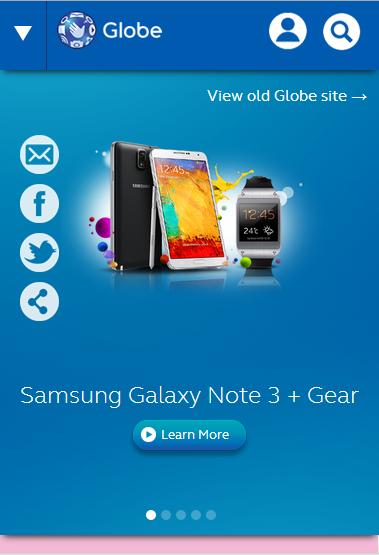
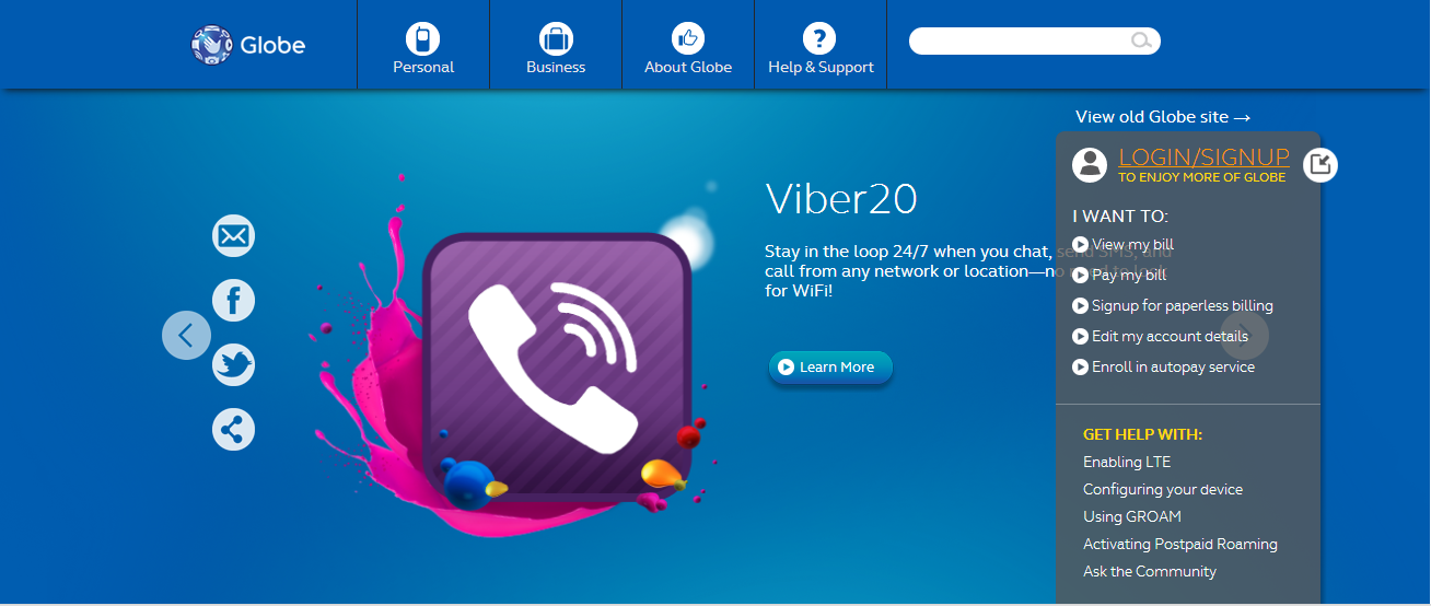
Case in point is Globe’s Beta website. It’s an ideal example of a well thought-off and consumer-centric website. It’s very navigable and has a minimalist vibe. It’s built in with customer engagement tools and non-intrusive login/quick-links. But more importantly, it looks great on smartphones and tablets. It’s just so much better compared to its old website. Take a look at some screen shots below.

Globe Beta Website’s Mobile Look

Globe Beta Website’s Browser Look
For my fellow bloggers, it’s time that we also embrace this trend as this isn’t just limited to corporate websites. At this age where consumers look up to our reviews and articles prior to making decisions, it’s best that design our website with them in mind. Ask the questions:
- Is it navigable?
- Does it look cluttered and pre-historic?
- Will you easily be able to interact or engage with your readers?
- Do you have social media (follow buttons) available?
- Is your website and your content searchable on the web?
- And lastly, does it look awesome on your mobile phone?
Sources: Website Grader, SimilarWeb, Google
Giancarlo Viterbo is a Filipino Technology Journalist, blogger and Editor of gadgetpilipinas.net, He is also a Geek, Dad and a Husband. He knows a lot about washing the dishes, doing some errands and following instructions from his boss on his day job. Follow him on twitter: @gianviterbo and @gadgetpilipinas.


