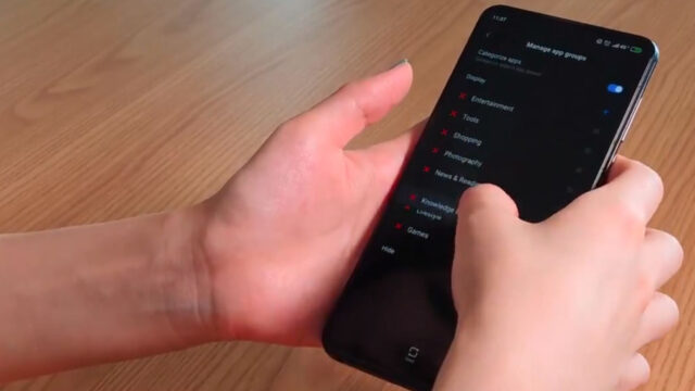
The updated version of the Poco Launcher has been launched by Xiaomi. The UI came along with the introduction of the Pocophone F1. The launcher was eventually released on Google Play for everyone.
We need you!
Do you want to experience POCO Launcher 2.0? Come and join us to be a user of POCO beta. A totally new launcher journey is waiting for you.
Download POCO Launcher 2.0 at https://t.co/hSpAZSnSNp pic.twitter.com/2Kjv9JUMjo
— MIUI (@miuirom) June 14, 2019
The changes polish the design and make the overall experience smoother with the app drawer. Now, this can have a semi-transparent background allowing to see the wallpaper under the white/black/gray layer. This transparency is customizable which gives users to have the main image and dark mode at the same time.
The customizability that was much loved in the first iteration of the Poco Launcher, like adding applications in groups, was built on by allowing users to delete some of them. This allows users to create their own sections.
 While there are speculations that the phone in the video could be the Poco F2, sources say that it’s likely the Xiaomi Mi Mix 3.
Source | Photos: MIUI Twitter
Ram found his love and appreciation for writing in 2015 having started in the gaming and esports sphere for GG Network. He would then transition to focus more on the world of tech which has also began his journey into learning more about this world. That said though, he still has the mentality of "as long as it works" for his personal gadgets.


