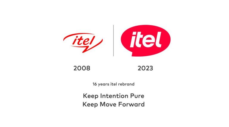
itel released its new and revamped logo as part of its celebration of 16 years in the industry. It introduces a fresh, modern outlook while embodying its commitment to innovation, accessibility, and customer-centered philosophy.
New itel Logo

The new logo retains the speech bubble which symbolizes the company’s commitment to communication and connectivity. Meanwhile, the new vibrant magenta color evokes a positive and youthful vibe. Lastly, the consistent forward slant shows the company’s focus on empowering and supporting communities through its products and services.
Overall, the new logo encapsulates the brand’s promise to “Enjoy Better Living”.

The company was founded 16 years ago and has since evolved from a mobile phone brand to a comprehensive “smart life” brand and has given rise to a diverse brand ecosystem. It now also offers a diverse range of products that includes smartphones, accessories, personal care products, and home appliances.
Ram found his love and appreciation for writing in 2015 having started in the gaming and esports sphere for GG Network. He would then transition to focus more on the world of tech which has also began his journey into learning more about this world. That said though, he still has the mentality of "as long as it works" for his personal gadgets.


