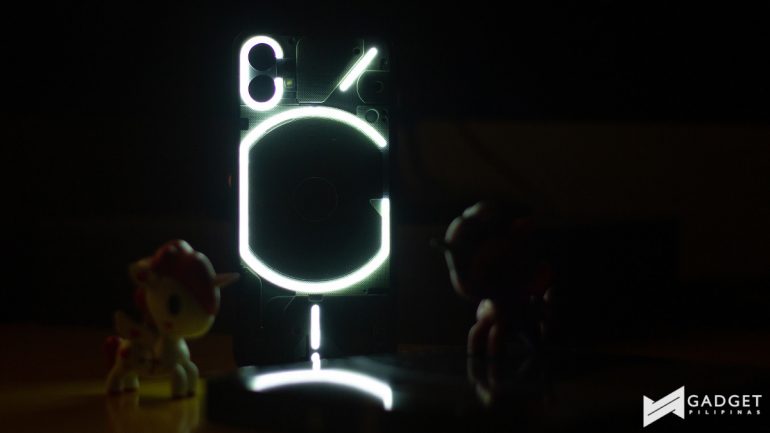
Nothing finally unveiled their first smartphone – the Nothing phone (1) last month. The company had picked up so much hype after the launch of the Nothing ear (1) last year and an impressive pre-launch build-up.
With all the hype though, the big question is whether or not it is actually worth it.
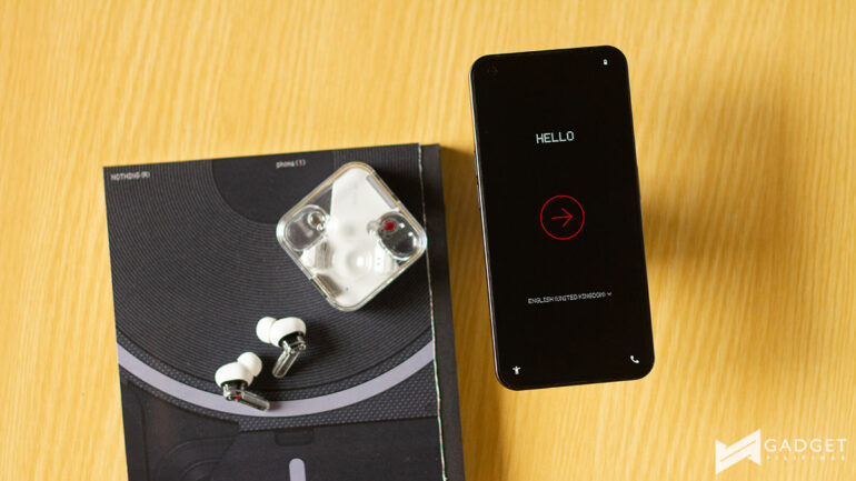
Locally, the device is available via Digital Walker and was just recently launched. It is priced at PHP 27,990 for the 128GB variant and PHP 29,990 for the 256GB option. We were given a unit to review and here’s our experience with the much-awaited Nothing phone (1).
Specifications
| Nothing phone (1) | |
|---|---|
| Display | 6.5-inch FHD+ OLED120Hz |
| Processor | Qualcomm Snapdragon 778G+ |
| RAM | 8GB |
| Storage | 128/256GB |
| Rear Camera | 50MP main 50MP ultra-wide |
| Front Camera | 16MP |
| Battery | 4500mAh battery 33W wired fast charging 15W wireless charging 5W reverse charging |
| Colors | Black |
Unboxing experience
@gadgetpilipinas Your first look at the Nothing Phone (1)!!! #techreviewph #gadgetpilipinas #unboxing #nothingphone1 @Nothing
♬ Relaxing lofi music(1014185) – Akase
Build and Design
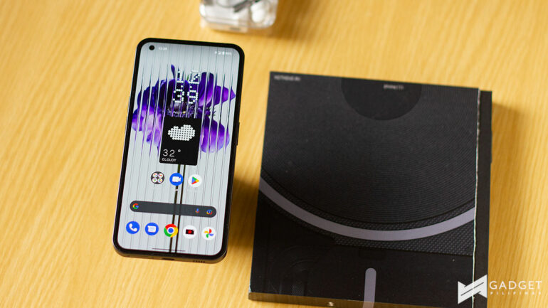
Like the Nothing ear (1), I think where the Nothing phone (1) shines is in its design. The company really did an amazing job making the device stand out in an already saturated Android smartphone market.
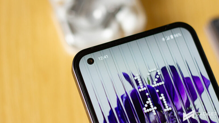
On the front, you have a 6.5-inch FHD+ OLED with a 120Hz refresh rate. It has a 16MP front camera in a punch hole in the upper left corner of the display. This looks pretty generic but I appreciate that the company opted to go for a flexible OLED panel to get even bezels around the display.
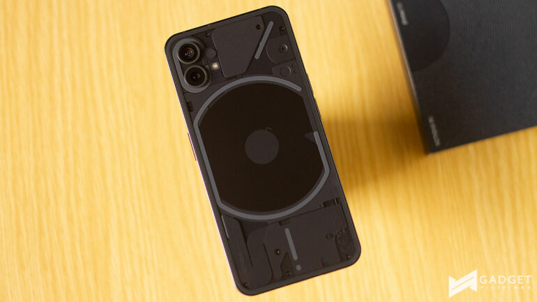
Around the back is where the party happens. It has a transparent back revealing the charging coil and some connections along with the Glyph Interface. We were given the Black option and while I was hoping for the White option, the Black had its own personality.
I have seen the transparent back design of the device in many photos throughout covering the device but it definitely looks more impressive in person.
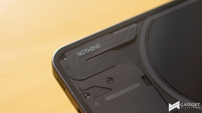
However, one problem I have with it is that it’s still shiny and at the end of the day, shiny finishes on devices will be problematic for fingerprints. Admittedly, it isn’t as bad because the transparent design allows you to look at even more things other than the fingerprints, but they’re still there.
As far as protection goes, it has a Corning Gorilla Glass protecting both the front and the back of the device.
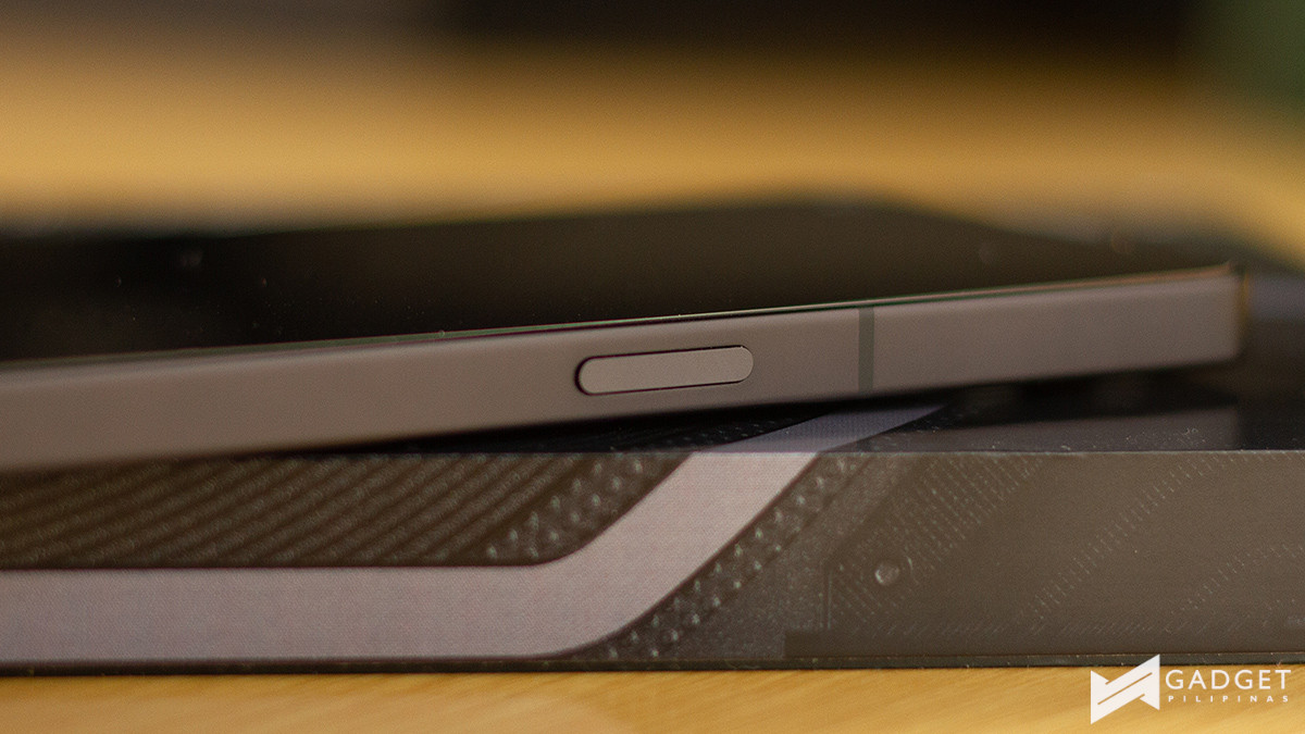
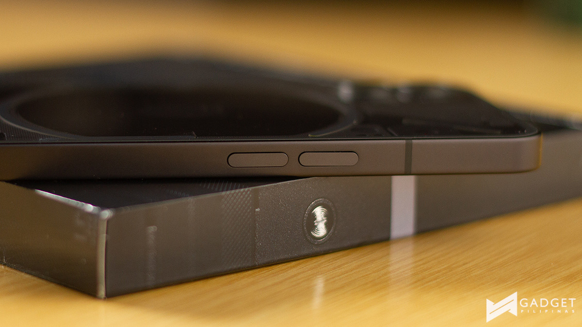
The side trim is built from aluminum with are squared off which gives it a more Apple iPhone design. I wasn’t too sure about this, to be honest, especially after getting used to more rounded sides. However, having used the phone (1), the squared side design makes taking photos with one hand so much easier by having a bit more grip.
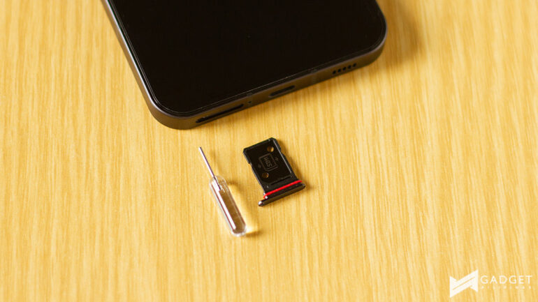
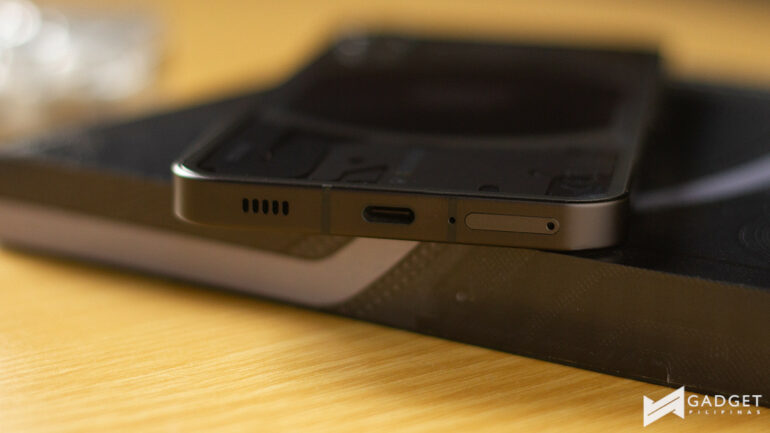
On the right of the device is the power button, while on the left-hand side are the volume rockers. At the bottom, you have the speaker grille, the microphone, USB-C port, and the SIM tray. On the top is another microphone.
Performance
Under the hood, the Nothing phone (1) is equipped with a Qualcomm Snapdragon 778G+ along with 8GB RAM and 128/256GB of storage. We received the varaint with 128GB storage.
Here are some of its benchmark scores for its CPU via Geekbench and GPU via 3DMark:
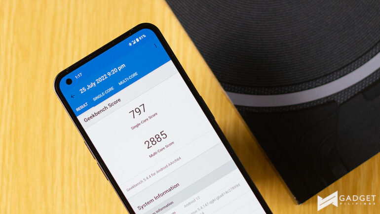
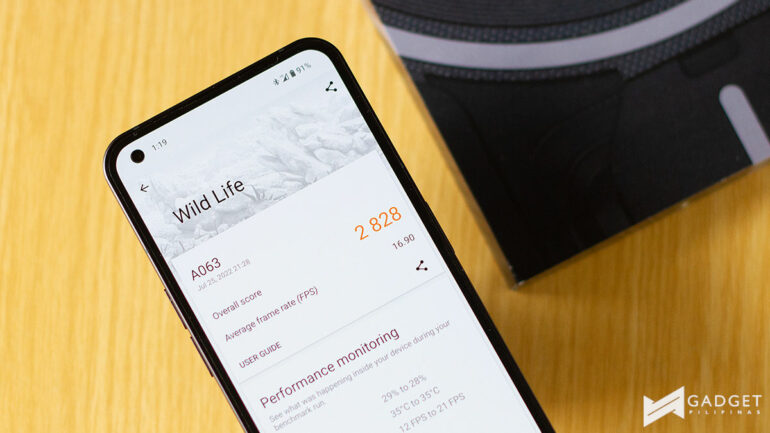
It may not have the latest Snapdragon 8+ Gen 1 nor the Snapdragon 8 Gen 1 or Snapdragon 888, but the Snapdragon 778G+ chipset is definitely quite impressive. Day-to-day use like checking social media, and watching videos on YouTube, TikTok, and Netflix was smooth like butter. I had little to no qualms.
I did my best to try a good mix of games from relatively lighter games like Mobile Legends: Bang Bang and Call of Duty: Mobile to heavier games like Genshin Impact and Diablo Immortal. There’s also League of Legends: Wild Rift and Ni No Kuni Cross Worlds.
I was able to play all the games including Diablo Immortal and Genshin Impact on the highest settings with just little hiccups every now and then.
Camera
The phone (1) is equipped with a Sony IMX766 50MP main sensor and a Samsung JN1 50MP ultra-wide camera around the back.
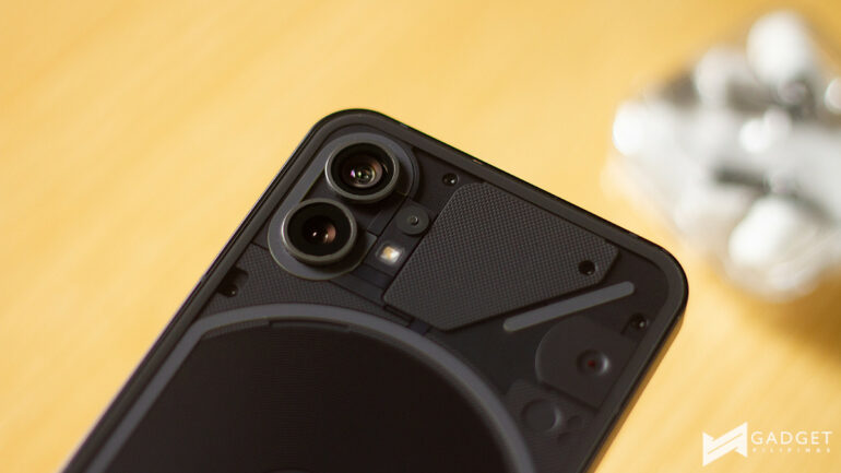
Despite not having three or more cameras, which seems to be the trend nowadays, I was glad to see a secondary sensor that is able to be at par with its main counterpart.
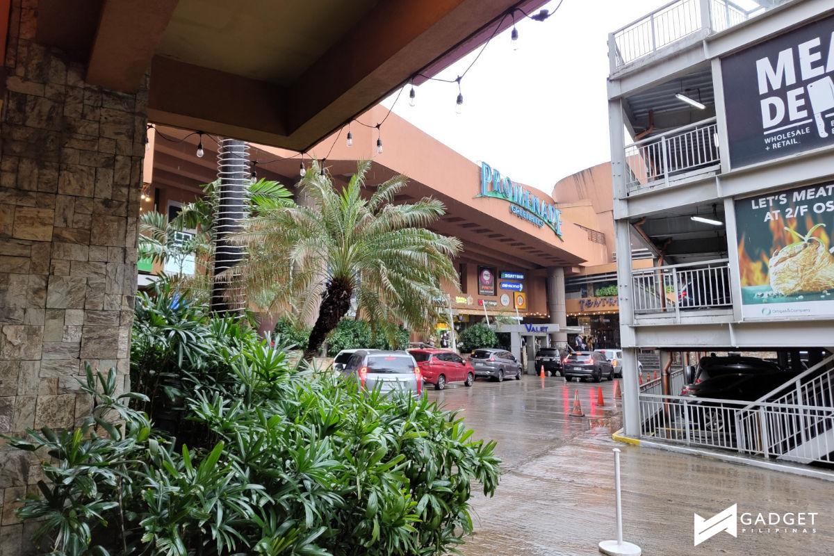
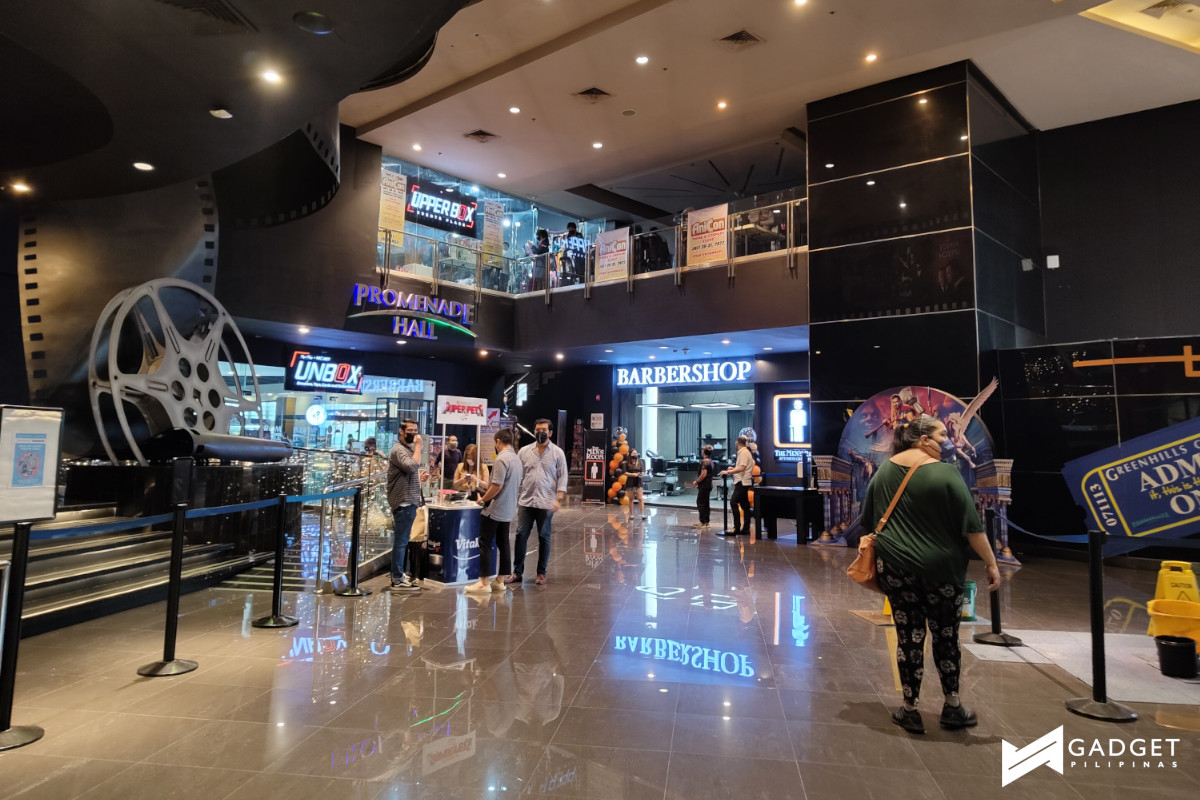
The duo offered good color reproduction and details, especially in brighter settings.
Here are some samples from both the main and ultra wide cameras:



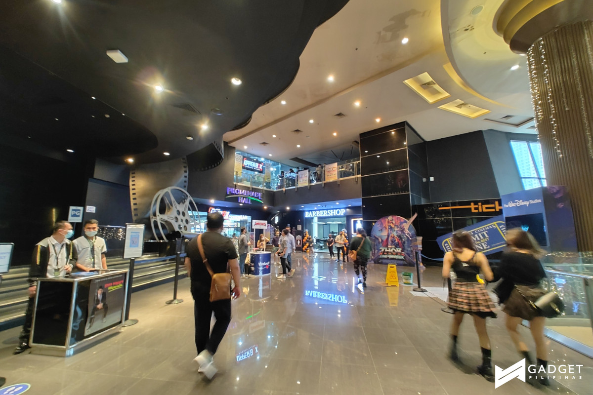


What I truly wanted to test though was how good the fill light offered by the Glyph Interface really was at offering light. Based on my test shots, it is a pretty good middle-ground between the sometimes overly bright flash and a regular shot. Additionally, with the fill light, you don’t get the annoying shadow that you get from using flash.
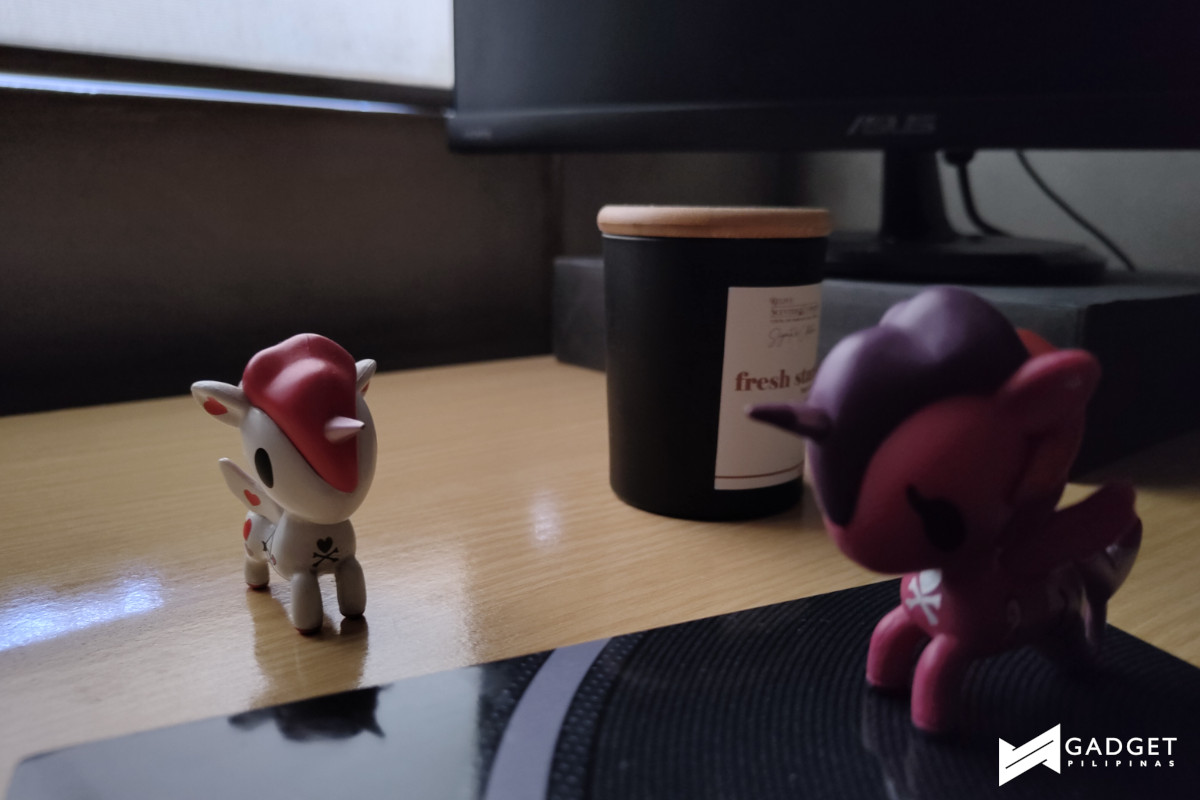
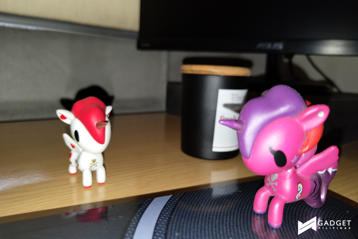
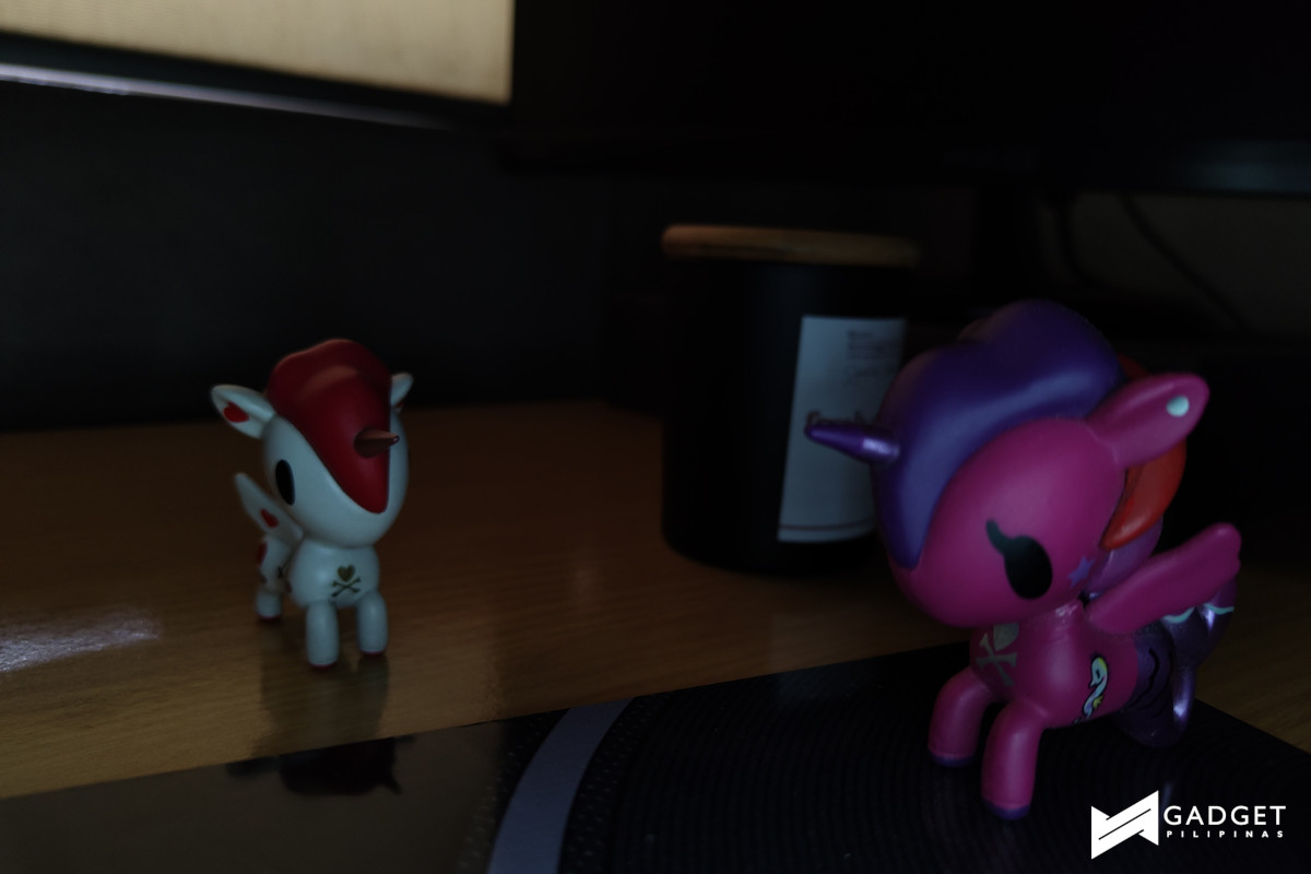
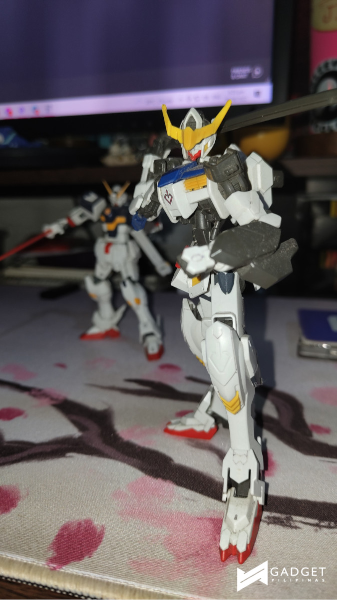
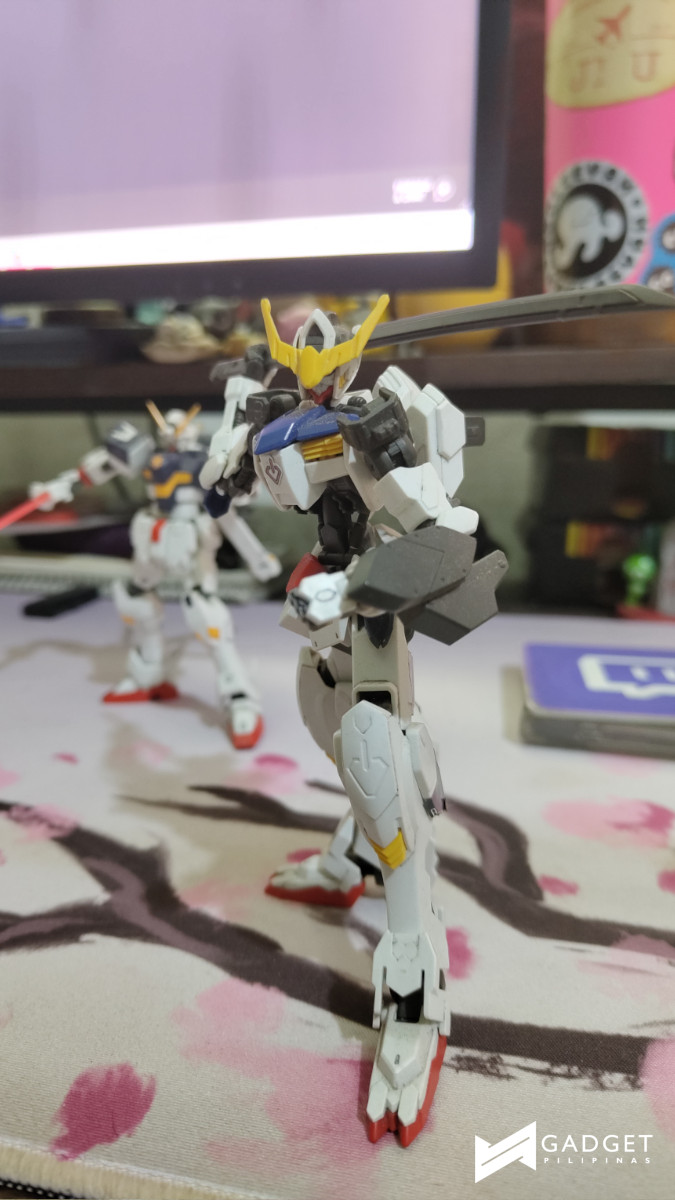
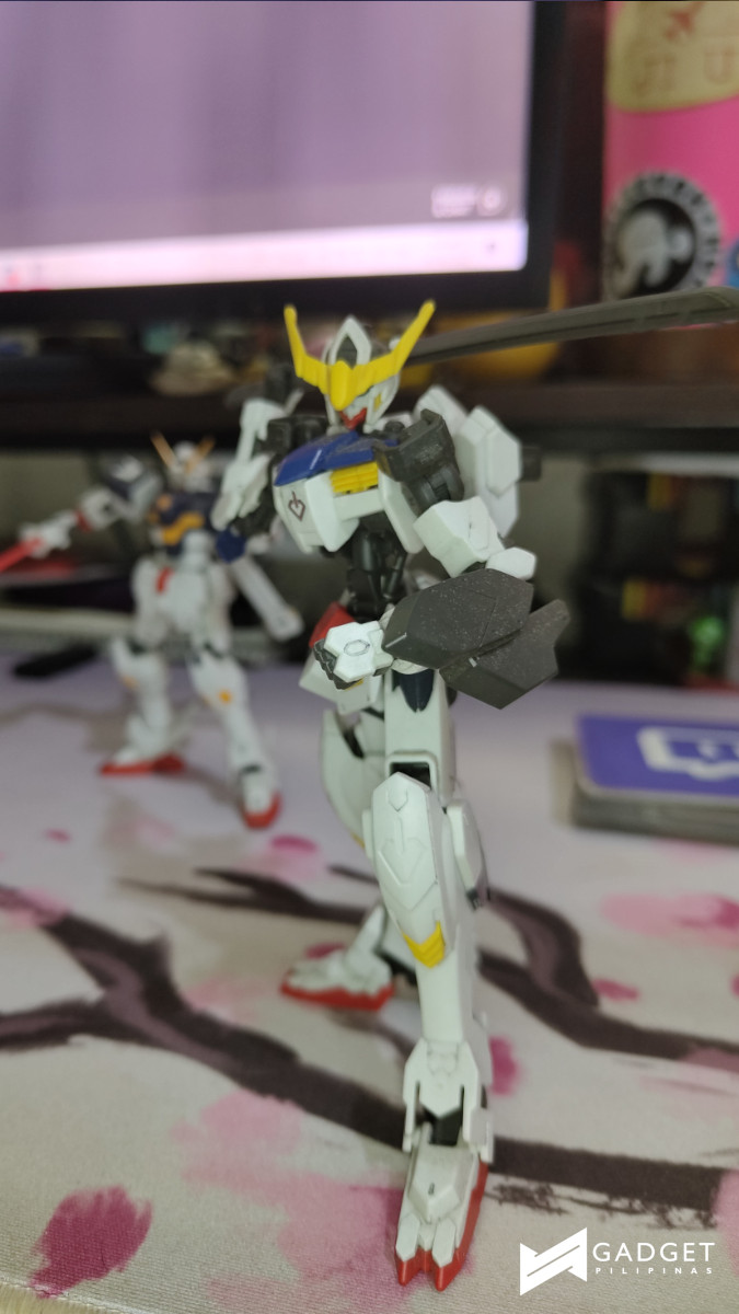
However, it only comes in handy if you’re into macro shots. Its light just isn’t bright enough to make a drastic difference when I was pretty far from what I was shooting.
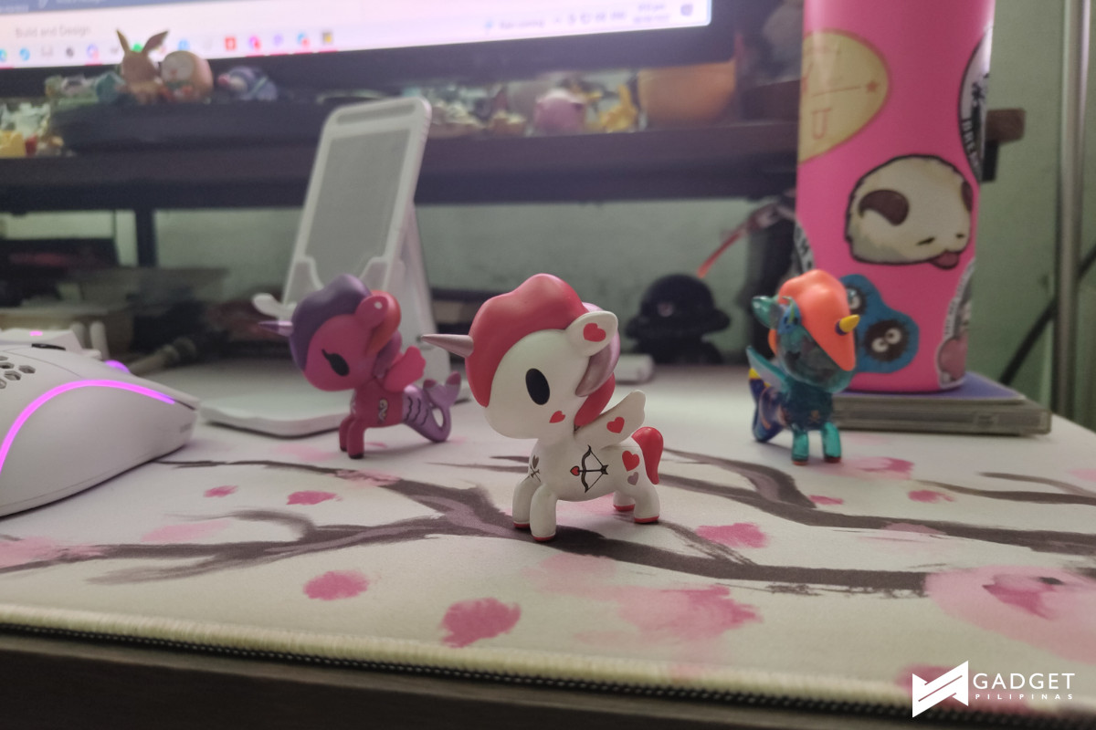
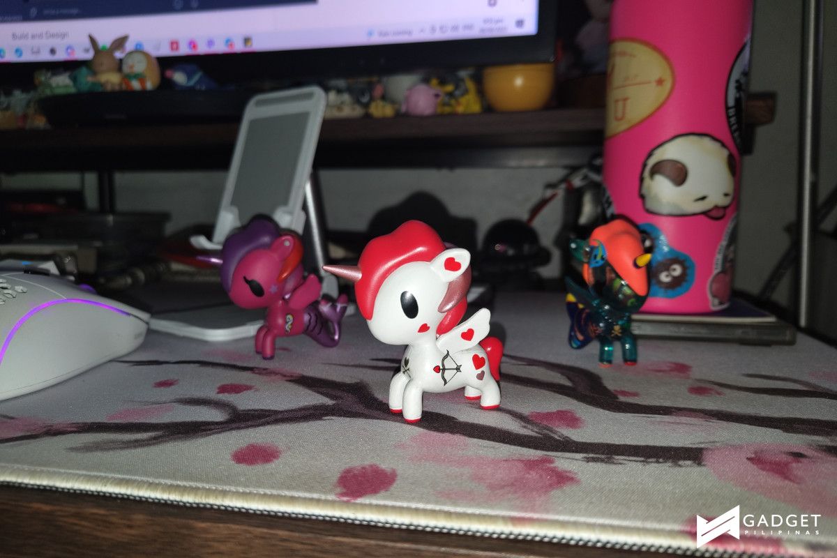
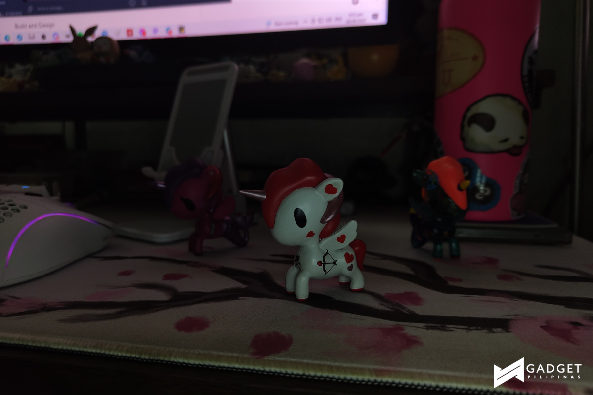
On the front is a Sony IMX471 16MP sensor. This, overall, is a pretty good decent camera that provided good detail and produced some good portrait shots.



Battery
The Nothing phone (1) is equipped with a 4500mAh battery with support for 33W wired fast charging, 15W wireless charging, and 5W reverse charging.
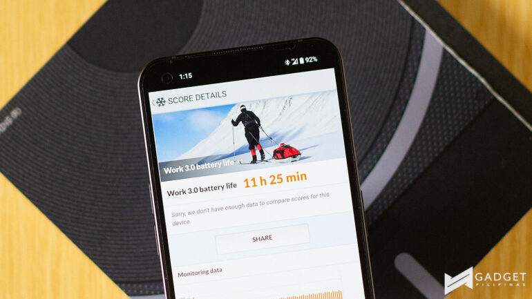
While its battery pack isn’t the biggest nor the smallest out on the market, it surprised me as I ran it through the PCMark battery test. It clocked in at 16 hours and 33 minutes on 60Hz refresh rate and 11 hours and 25 minutes on 120Hz. Yup, 16 hours!
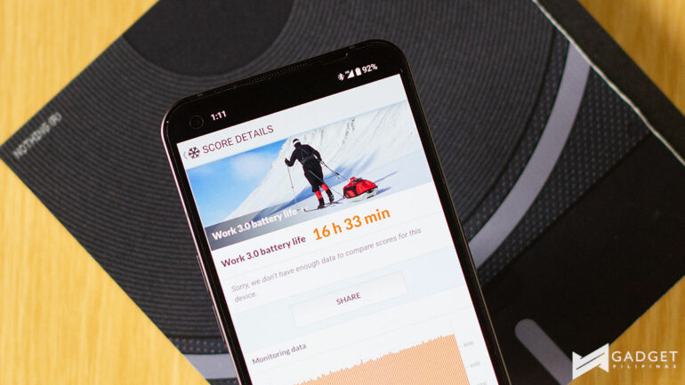
I, of course, used it solely on a 120Hz refresh rate and the result pretty much comes close to 11 hours with more day-to-day use. It definitely will be lower if you have a couple of heavy gaming sessions but for my daily use, which includes a game or two, it was still able to survive a full work day and then some.
It is good to note that the device doesn’t come with a charging adapter so unless you have a 33W fast charger or more, you probably won’t make the most of the fast charging. Luckily, I had a 66W fast charger on me, while I understand that it doesn’t charge at the full 66W, it’s still better than nothing.
With the 66W fast charger, it charged from 0% to 100% in about a little under an hour or so. This is pretty reasonable especially with me hardly ever draining out a device.
Software
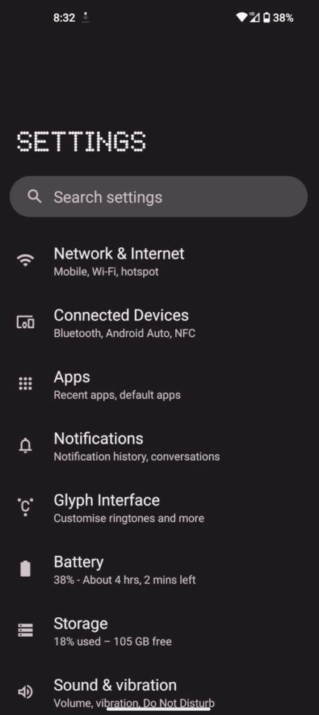
Nothing OS is as pretty bare bones a UI as they come. It had little to no bloatware which is always refreshing to see.
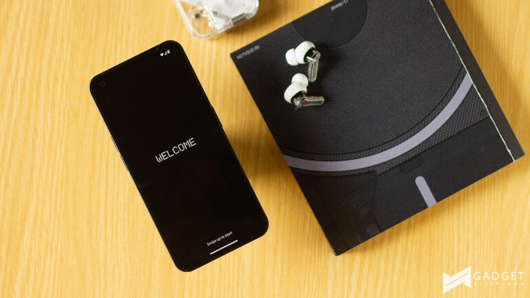
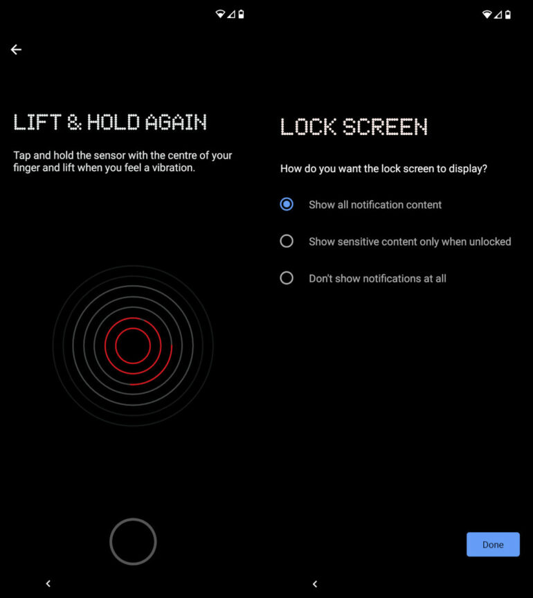
From the get-go you get the already iconic Nothing dotted font face greeting you and continues throughout the setup process and even in the Settings screen. Additionally, it is among the few Android skins that run on Dark Mode by default. This isn’t too surprising with the company’s branding being mostly black.
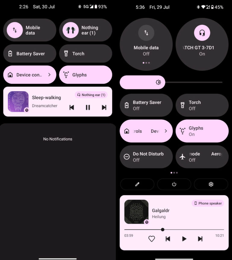
One of the first things that really stood out for me was the notification panel which, again, takes it from base Android 12 but highlights the connections by giving the internet and Bluetooth larger ovals. However, it took some getting used to, especially having to drag down the panel to get to be able quickly to switch between mobile data and WiFi. Aside from this though, visually, it’s definitely a welcome change.
Despite it being the company’s first Android skin, it’s actually pretty impressive with a little touch of its uniqueness.
Glyph Interface
Before we get to the verdict, I think the Glyph Interface deserves its own segment. It is the most unique feature on the device and I was curious whether it was something that’d just be a cool party trick or actually something I’d use everyday.
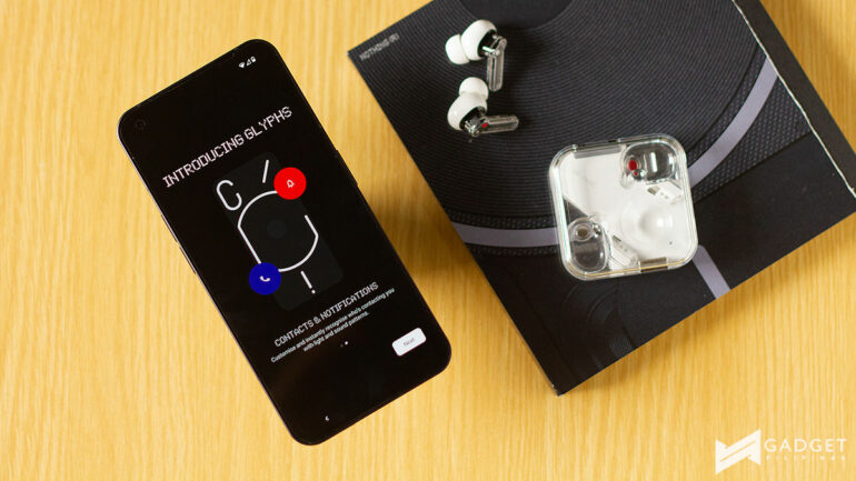
Sadly, I think it was more of the former than the latter. The most useful features for me were the charging meter and the Google Assistant feedback. Which I still hardly used, if I were being honest.
As far as other things go, it only really works as a fill light in macro shots and is pretty limited as far as notifications go. You can set up separate patterns and ringtones depending on the contact that’s calling you but that’s basically it.
I wish there was a way for you to set up different patterns depending on the app notification but I understand that that would be something that requires working with the app developers. I think that’s one way of improving the practicality of the Glyph Interface.
Product shots courtesy of Rianne Ronquillo
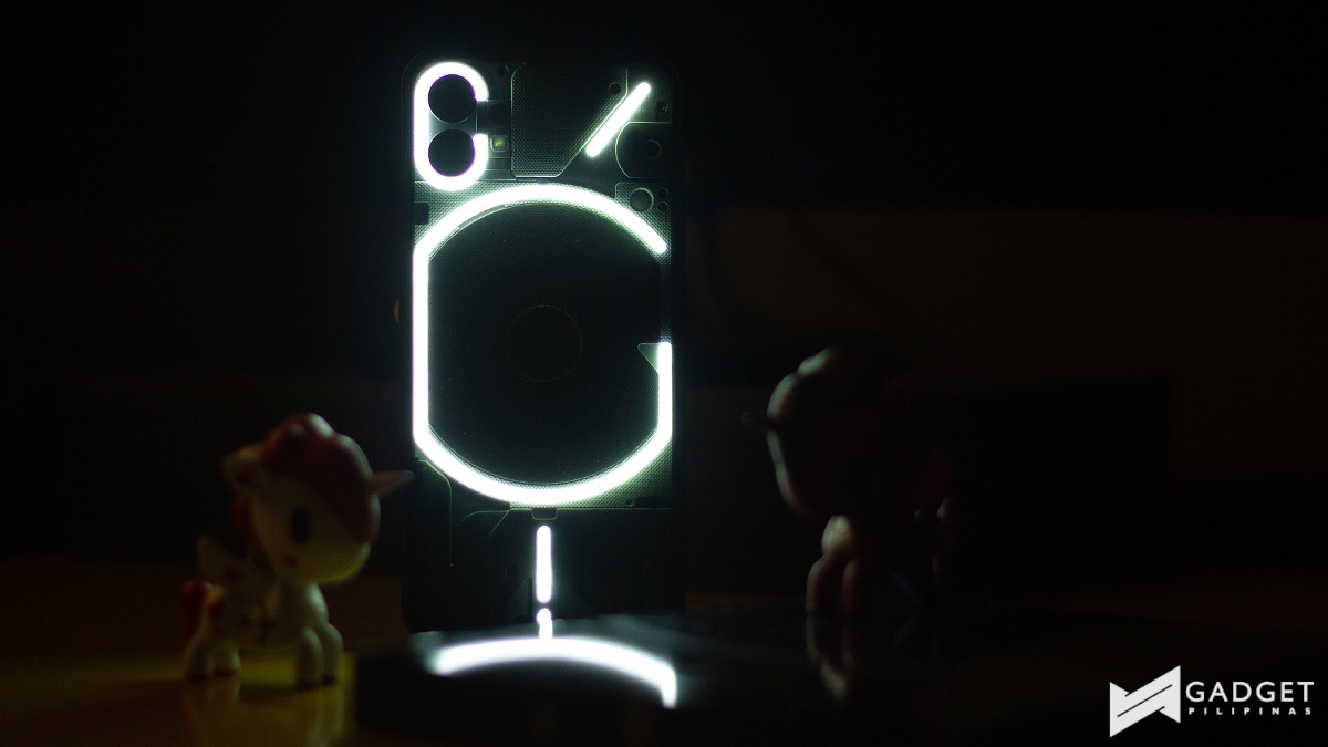
Nothing phone (1) is definitely a curious device. It looks amazing and its performance is actually pretty impressive but in regard to performance, I think there are other devices you can check out.
As I mentioned at the beginning of this, its design is really where it shines. It’s quite a good reimagining of the smartphone which I think has come at a good time especially when every other Android phone looks similar to another device.
However, at the end of the day, it’s a high-end mid-ranged device priced at PHP 27,990 and PHP 29,990 for 128GB and 256GB storage, respectively. It does everything but doesn’t really excel in anything. Personally, I enjoy the device and it just really works with little to no bells and whistles, just how I like my tech.
Ram found his love and appreciation for writing in 2015 having started in the gaming and esports sphere for GG Network. He would then transition to focus more on the world of tech which has also began his journey into learning more about this world. That said though, he still has the mentality of "as long as it works" for his personal gadgets.

