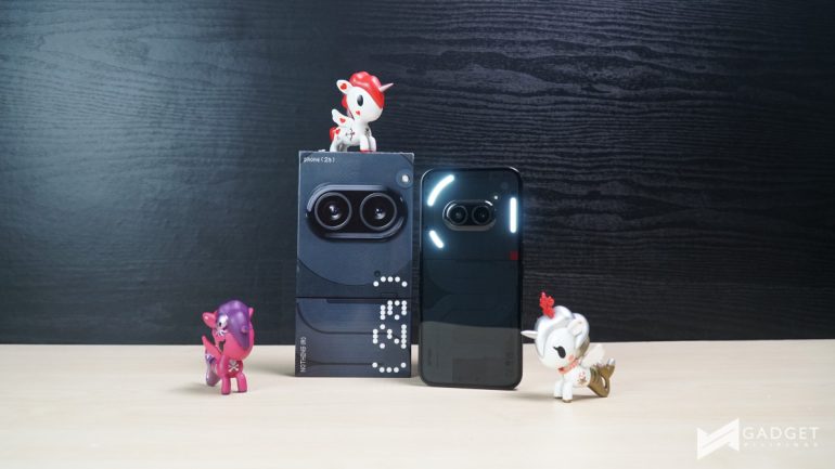
Nothing has just expanded its phone offerings with the Nothing Phone (2a), slotting between the Phone (2) and Phone (1). The new device was revealed to be a clear step up from the Phone (1).
We were given the opportunity to check out the Phone (2a) thanks to our friends at Digital Walker. However, because I’ve only had the device for a couple of days, I decided to share my early impressions on the latest member of the ever-growing Phone series from Nothing. Yes, a full review is coming soon!
Nothing Phone (2a)
Nothing Phone (2a) – Full Specifications
| Display | 6.7-inch FHD+ AMOLED 120Hz refresh rate |
| Processor | MediaTek Dimensity 7200 Pro |
| RAM | 8/12GB |
| Storage | 128/256GB |
| Rear Camera | 50MP main (f/1.88) 50MP ultrawide (f/2.2) |
| Front Camera | 32MP (f/2.2) |
| Battery | 5000mah 45W fast charging |
| OS | Nothing OS 2.5 (Android 14) |
| Colors | Black Milk |
Nothing Phone (2a) – Unboxing
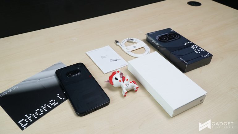
The Phone (2a) comes in a more compact package but comes with the same inclusions as its predecessors. You can watch our unboxing video on TikTok, Instagram, or Facebook.
Nothing Phone (2a) – Hands-on Experience
The Nothing Phone (2a) is the first deviation from the established design of Nothing.
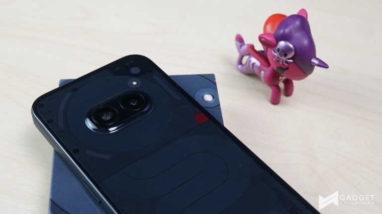
It still has the transparent back and Glyph Interface but the rear camera has been moved from the upper left to the center of the top third on a circular grid system. Additionally, the Glyph Interface has been drastically lessened with three segments from the 10 of the Phone (2). The dual camera module also has a bubble/bump that helps smoothen out the rear panel.
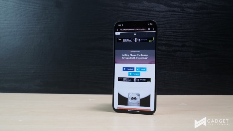
The Phone (2a) is built around a 6.7-inch 120Hz FHD+ AMOLED panel which makes it the same size as the Phone (2). Despite the same size though, the (2a) feels very different in the hands. This is mostly thanks to the new design on its sides which soft textured matte design and eventually transitions to a glossy finish that ties in the sides with the black panel.
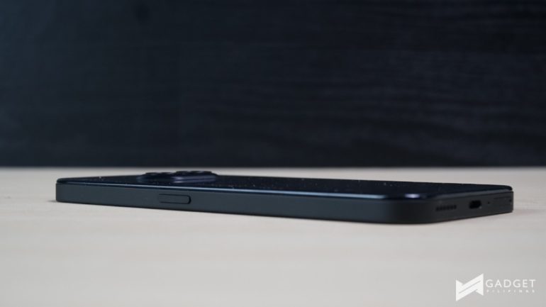
With most devices now moving to a glossy or a matte finish, this return to a soft textured design feels strangely refreshing.
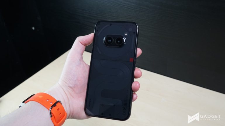
I’ve used the Phone (2) as my daily driver for a while now and the size is identical. The 6.7-inch display, at this point, is the norm and thus requires little to no adjustment as far as handling the Phone (2a) goes.
The new Phone is equipped with a MediaTek Dimensity 7200 Pro chipset and has a large 3200mm2 vapor chamber to keep the SoC at lower temperatures. In my short time with the device, it has remained relatively cool even while downloading the large patches of Genshin Impact and Honkai Star Rail.
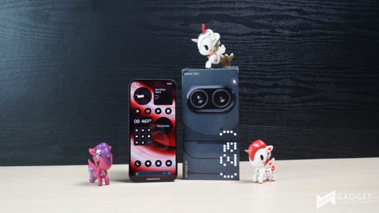
I’ll run the device through a bit more rigorous use in time for our full review to test the chipset and the cooler. Yes, this includes playing over hours on end.
As far as battery goes, it has the largest on a Nothing Phone at 5000mAh with support for 45W fast charging. The larger battery, based on my experience so far, offered around 12-15 hours of battery depending on what I did throughout the day. We’ll run the device through the PCMark Battery on the three refresh rate modes for a more objective test for our full review.
Nothing Phone (2a) – Camera
As far as cameras go, the Phone (2a) has a 50MP main camera and a 50MP ultrawide lens. I was able to take some photos and based on my initial shots, it seems to be still quite a capable shooter.
We assume that the company carried over the 50MP Sony IMX890 main and 50MP Samsung JN1 ultrawide cameras from the Phone (2).
Here are some sample photos:
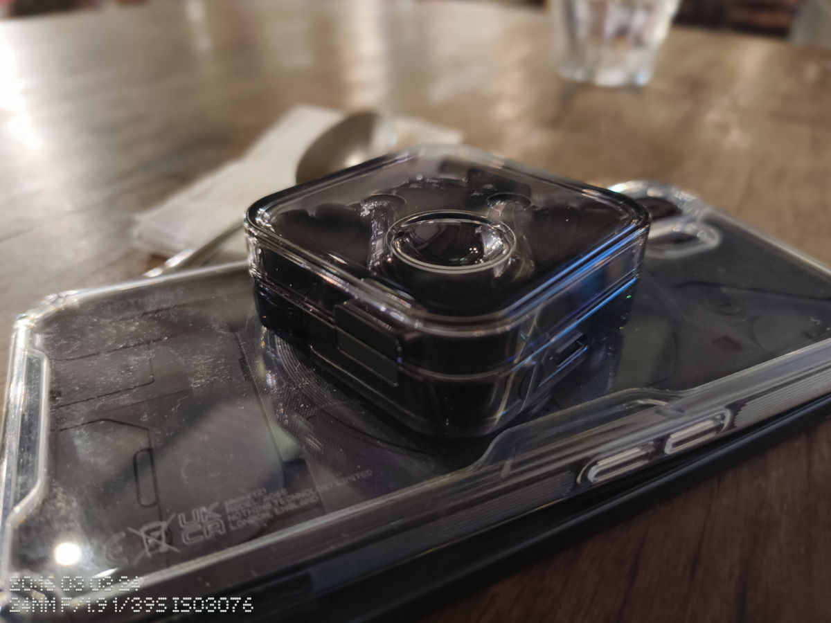



On the front, the (2a) also has a 32MP sensor, which we also guess is the same Sony IMX615 lens as its predecessor.
Here are some early photos:


Initial Verdict
I’ve only really had the Nothing Phone (2a) for a couple of days and my experience with it so far has been pretty good. It definitely lives up to its slot between the current Nothing phones out in the market.
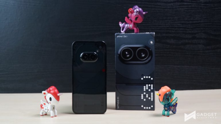
The rear panel, from its early leaks to its official teaser, has been quite controversial and has split the supporters of the brand. I initially found the leaks quite strange, it felt like they just took the module of the Phone (1) and (2), flipped it on its side, and put it in the middle of the device.
However, as I removed it from the box and saw it in person, I grew to like the new design. A new but familiar design definitely makes sense with a device that enters a new tier in the company’s offerings.
Stay tuned for our full review of the Nothing Phone (2a) as we take a closer look at the device with benchmarks to boot.
For more information, visit the official website.
Ram found his love and appreciation for writing in 2015 having started in the gaming and esports sphere for GG Network. He would then transition to focus more on the world of tech which has also began his journey into learning more about this world. That said though, he still has the mentality of "as long as it works" for his personal gadgets.

