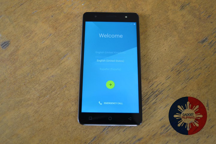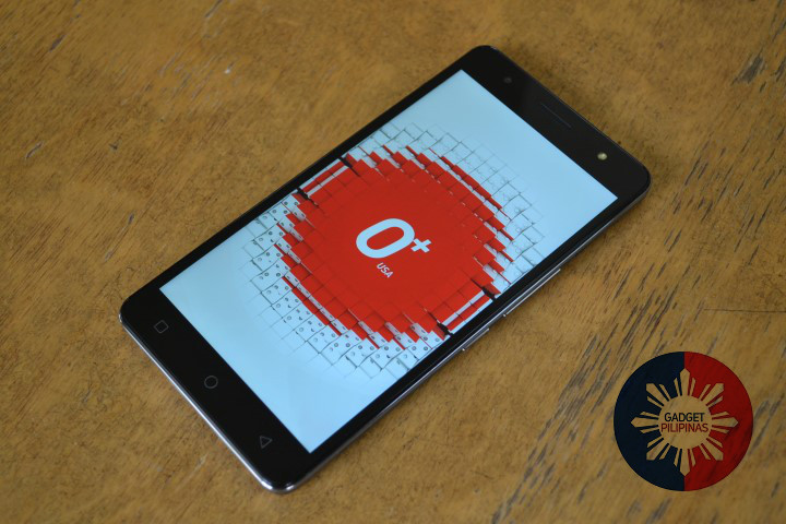
Roughly two weeks ago, we presented the O+ Ultra smartphone from O+ USA in a quick unboxing and first impressions post. If you haven’t read that one yet, then go ahead and check it out here. And here now is our full review with more of what we have to say about it, especially that interestingly beefy 4,000mAh battery.
Design and physical attributes
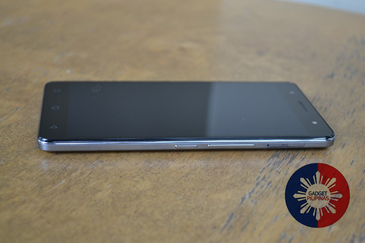
The O+ Ultra is a phablet not unlike many phones that we’ve already seen before. But it does have some still fairly unusual physical features.
Firstly, it has a non-removable battery cover. So that 4,000mAh battery that we mentioned earlier? It can’t be taken out or replaced as easily as on other phone models.
This also means that both the SIM card slot (which takes in two cards, mind you) and the microSD card slot can’t be found under the battery. Their respective slots are both present on the Ultra’s sides instead.
Not that that’s a bad thing, of course. In fact, we think this may have contributed to the Ultra’s thinness. It may be a big phone, but it’s certainly not a chunky one. The combination of the O+ Ultra’s apparent slimness and the way that the back cover is designed made for a fairly ergonomic handset considering its size.
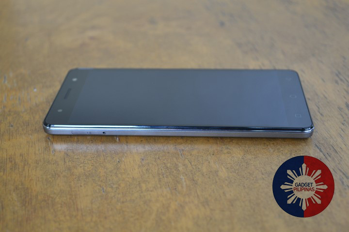
The sides of the O+ Ultra aren’t only adorned with SIM and microSD card slots. There are also a few hardware buttons present, albeit only on the right side. Right around the center of the right side of the Ultra, there’s a power button/lock switch. And the volume rocker can be found right above it, so there are no buttons on the left side at all.
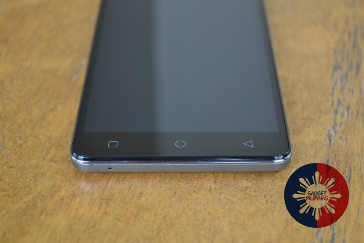
You’ve probably noticed this by now already, but the O+ Ultra uses capacitive touch menu button right below the display. And these buttons are based on the on-screen menu keys in Android L, so they look nothing like the ones that you may be familiar with if you’re coming from KitKat or any other earlier versions of Android.
Although there’s nothing really wrong with it, we can’t help but imagine just having these menu buttons on the screen instead of outside it, especially since the display seems large enough to accommodate them. With that said, we really like the look of these buttons because of how simple they are. From left to right, the buttons mean Recent Apps, Home, and Back.
Display and camera
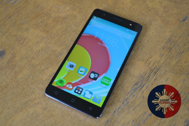
Speaking of the display, the O+ Ultra comes with a 5.5-inch IPS panel with a native resolution of 1280×720. So it’s an HD phablet, which isn’t exactly new. But we guess the formula works so O+ USA didn’t feel the need to change it in the O+ Ultra.
As you can imagine, the display is large and bright, with excellent viewing angles thanks to its use of an IPS panel underneath the touch sensors. The display showed no signs of typical smartphone defects in the time that we used it. Not once did we see a dead pixel or an unresponsive part of the screen. Basically, it just worked. And quite well, at that.
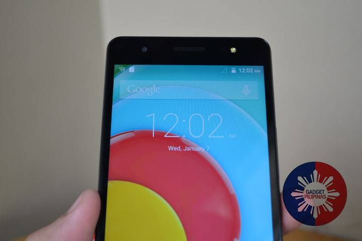
The O+ USA standard Android skin appeared to fit well with Android L, and on the large screen there was plenty to appreciate.
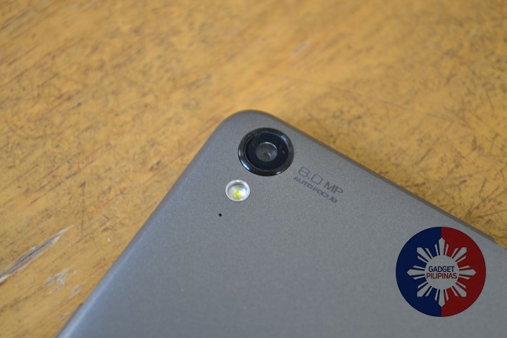
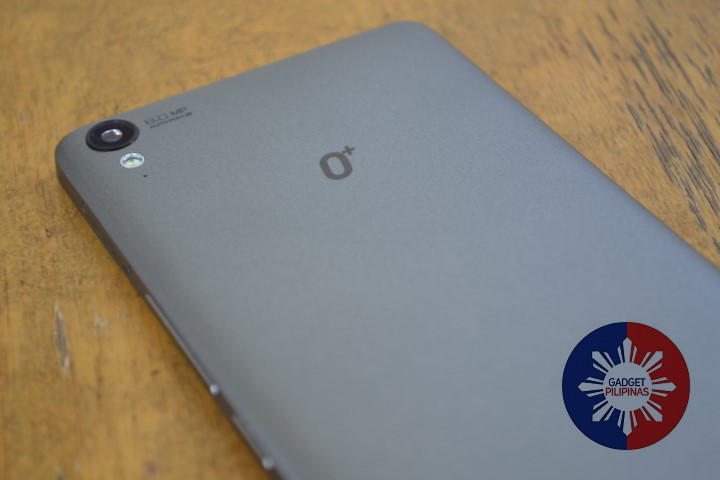
And as long as we’re talking about things that we can appreciate, we might as well bring up the camera now. The O+ Ultra actually has two separate cameras on it — like most smartphones of today. First, there’s the main camera present at the back. It uses an 8-megapixel camera sensor and has a single-LED flash with an accompanying pinhole mic for audio capture.
Then there’s also a front-facing 5-megapixel camera, which you can see as one of the holes above the display on the front. It also with its own LED flash unit, positioned right across it above the phone’s display. This front flash is not entirely necessary when using the Ultra to take casual selfies, but it’s definitely useful for those days when the sky is more gloomy than usual, or when you’re taking pictures with friends in dark places like night clubs or some other dimly-lit hangout spot.
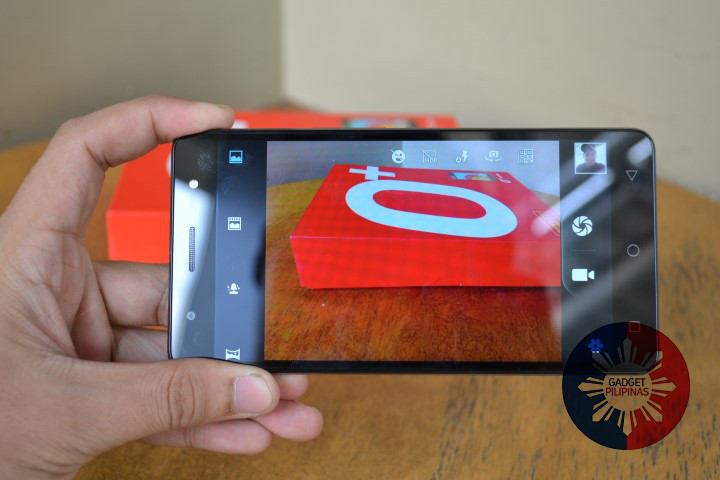
At the end of the day, it’s still the rear camera that you really want to use simply because it has the superior sensor and offers better options not just for still imaging but also for recording videos. These better options include HDR image capture and even QR code scanning. Whenever you’re feel like you just want to take selfies that are “good enough” however, it’s perfectly fine to rely on the front camera. Its output is more than acceptable.
Audio and gaming
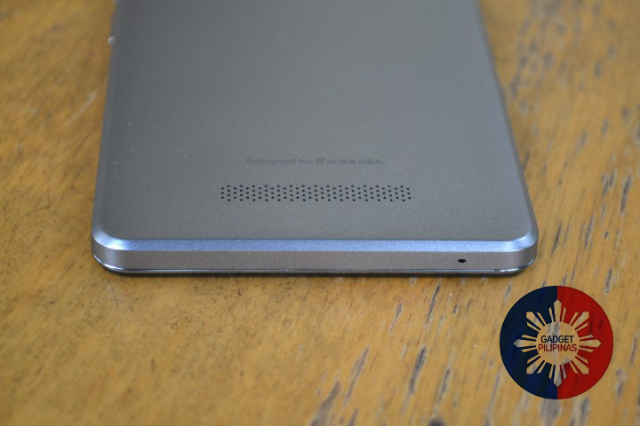
The O+ Ultra comes with a rear-facing speaker setup. This seemed fine at first, but after a couple of weeks of testing, we found that it isn’t exactly the optimal speaker position especially if you plan to use the phone for movie watching and mobile gaming.
What happens when you play a game on the O+ Ultra, for example, is the in-game audio gets blasted away from your ears. And not only that, depending on how you hold the phone in your hands, you may actually end up muffling the sound a little bit. It takes a few seconds to adjust for a better audio experience, so it’s not exactly a huge hassle. But the point is that it’s still not the best place to have the speaker.
Otherwise, we had no issues with the speaker in terms of clarity and loudness.
Smart features and Web browsing
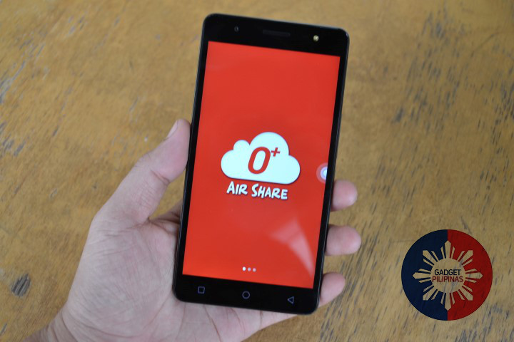
The Ultra wouldn’t be a proper O+ USA smartphone without some useful software addons. O+ Air Share is notably present, along with every other O+ USA enhancement you can think of — and that includes that familiar Android skin that can be seen on top of the OS.
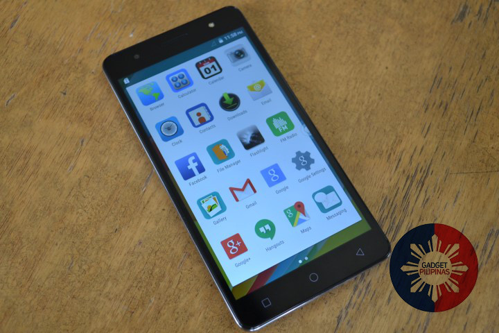
The OS on the Ultra, of course, is Android 5.0 Lollipop. The Launcher is unaltered, but some of the icons have been made to look different. The notification bar icons are taken straight from Android L standard, and the rest of the OS looks mostly the same.
It’s the inclusion of extra apps and features that makes the Ultra a bit more special. For one thing, we found a handful of apps that we think are quite useful, even if they’re all simple and cost no money at all. One free and pre-installed app that we really like is the Flashlight app. It’s always a great way to use the camera flash in a way that it wasn’t intended, and we always install it on any phone that we have.
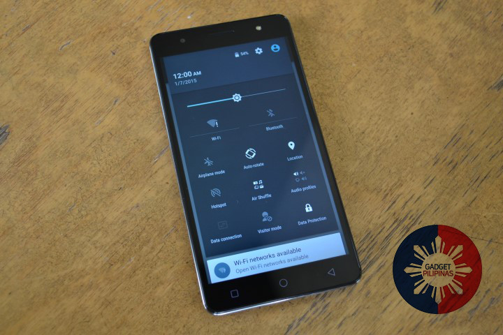
Since it’s an Android L phone, you’ll find the familiar set of quick settings buttons from the top of the screen if you scroll down. But perhaps none of these are even remotely close to being as useful Power Plus, which we’ll talk about next.
Battery life
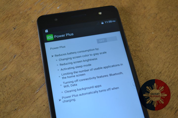
What is Power Plus? It’s an exclusive battery saver feature that somehow manages to stretch the already long-lasting 4,000mAh battery even more. As it says on the app’s default screen, Power Plus…
Reduces battery consumption by:
- Changing screen color to grayscale
- Reducing screen brightness
- Activating sleep mode
- Limiting the number of usable application in the home screen
- Turning off connectivity features
- Cleaning background apps
Power Plus is pretty nice to fall back on, and easily makes the O+ Ultra much simpler and easier to use. But even without it, the O+ Ultra gives a stellar performance in terms of battery life anyway.
To test the O+ Ultra’s battery, we downloaded and installed FIFA 15 UT (Ultimate Team) to play. With brightness and volume both maxed out, and Wi-Fi and Bluetooth both on and connected, the O+ Ultra managed to last for more than 6 hours of non-stop gameplay. That’s better battery life than most top-of-the-line portable gaming consoles nowadays.
O+ USA also sent us this info on the Ultra’s battery performance based on tests they themselves conducted in their office:
Games (Online)
- Wi-Fi connected
- Clash of clans (with COC reloader)
- Full volume
- Full brightness
- Up to 5hrs & 51min
Games (Offline)
- Wi-Fi off
- Plant VS Zombies 2
- Full volume
- Full brightness
- Up to 5hrs & 36min
Movie
- Wi-Fi connected
- LOTR movie, full HD
- Full volume w/ headset
- Full brightness
- Up to 9hrs & 26min
Standby time
- Up to 680hrs – based on specs sheet
Impressive? We agree. And based on tests we did ourselves, like the FIFA 15 UT battery performance mentioned earlier, we can vouch for these battery results.
The best part about the absurdly long-lasting battery is the fact that it doesn’t actually take that long to charge fully. We only needed to recharge the review unit 4 times in almost two weeks. And each time it only needed 2-3 hours for a full charge. We made sure to keep the phone off while charging, though. And that might have helped. Unless you do exactly that, your own results may vary (if only by a bit).
Conclusion
People like to bring up the battery as the one part of every modern smartphone that hasn’t quite developed as fast as a phone’s other requisite parts. We’re now at a point where we can fit 4k resolution panels onto 5- to 6-inch screens, have mobile processors that would put some older generation desktop processors to shame, and yet our battery tech is still only good enough for half a day’s worth of mobile computing per full charge.
Well, having tried and tested the O+ Ultra, it seems that the solution for the battery life problem in most smartphones today is so simple that it’s almost stupid: just fit a bigger battery in it. Because guess what? It actually works. It’s like what we said in our unboxing feature: like more Coke in a Coke bottle, or bigger feet fitting in a smaller person’s shoes.
After being used to carrying power banks (take note of the plural), using the O+ Ultra actually felt kind of bizarre. You see people walk around with their eyes darting from one side of a room to the other, searching for an available power outlet. Or you might see them carrying nondescript drawstring bags, hoping that they still have some juice left to recharge their dying mobile devices and continue poking friends on Facebook. This quickly becomes a foreign concept to anyone that starts using the O+ Ultra. The best time to own this kind of phone is yesterday. The second best time is now.

