Today, we’re going to see how the new ASUS Zenfone 5’s design stacks up to the competition. We’re going to look at all sides, and try to give an impression of how it feels to work with and hold this device in your hand.
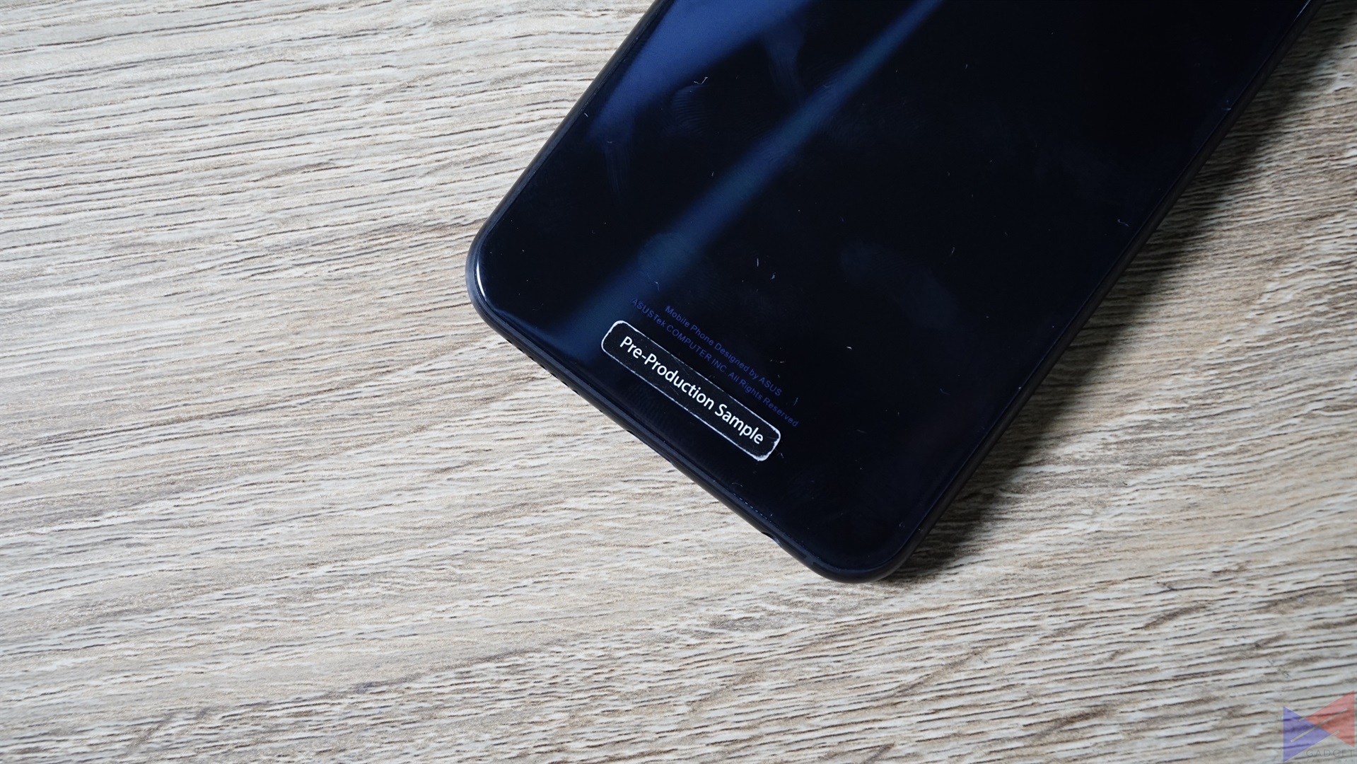
Unfortunately, the unit we used for this overview is a pre-production sample, so those who want to see benchmarks and first camera samples will have to wait until we get our hands on a retail unit.
ASUS Zenfone 5 Specs
- Qualcomm Snapdragon 636 octa-core processor with ASUS AI Boost
- 4GB/6GB of RAM, 32GB/64GB of storage expandable via microSD card (Up to 2TB)
- 6.2-inch FHD+ 19:9 IPS display with 2.5D Gorilla Glass, 90% Screen-to-Body Ratio, AI Display
- 12MP + 8MP rear cameras, Sony IMX363, f/1.8
- Night HDR, OIS, EIS, PDAF, 4K Video Recording, RAW File Support
- 8MP front camera, f/2.0, 120° wide-angle lens
- Fingerprint scanner, Face Recognition
- Dual Speakers with Smart Amp, Noise Cancellation, Hi-Res Audio and DTS Headphone: X support
- ZenUI 5.0 on top of Android Oreo
- 3,300mAh battery with ASUS BoostMaster Fast Charging and Smart Charging
Front
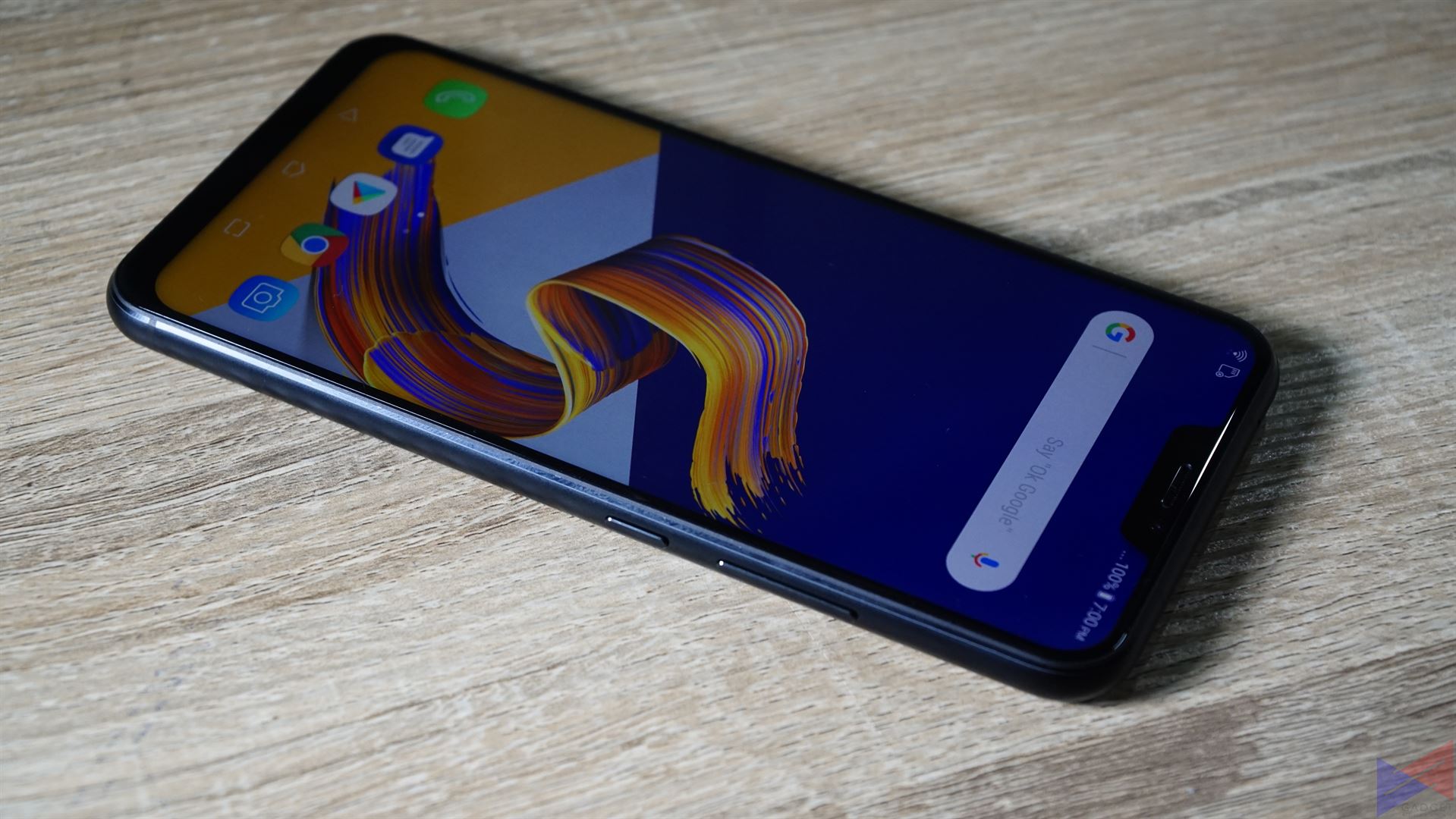
The Zenfone 5’s design is a massive change compared to the previous iteration. Now, you get a full-screen display with a 19:9 aspect ratio, along with a notch on top that houses the front cam and other sensors, that’s reminiscent of another smartphone brand.
The notch isn’t really anything that ruins the design, and of course, you’d always want less bezels and more screen right? In this case though, I think that it would’ve been better if they went with a bit more bezel, and take out that notch. In any case, It’s also a good feat as to being able to put a 6.2-inch screen in what’s basically a 5.5-inch body (90% screen to body ratio).
Speaking of the display, the IPS panel really shines here. While colors aren’t as vibrant as say a Super AMOLED display, it’s still more than enough to give the screen a vibe of liveliness, which makes it more enjoyable to use.
The Zenfone 5 runs on ZenUI 5 on top of Android Oreo, which should offer a number of nifty features, apart from the minimal look. We’ll be exploring it further, in our full review.
Rear

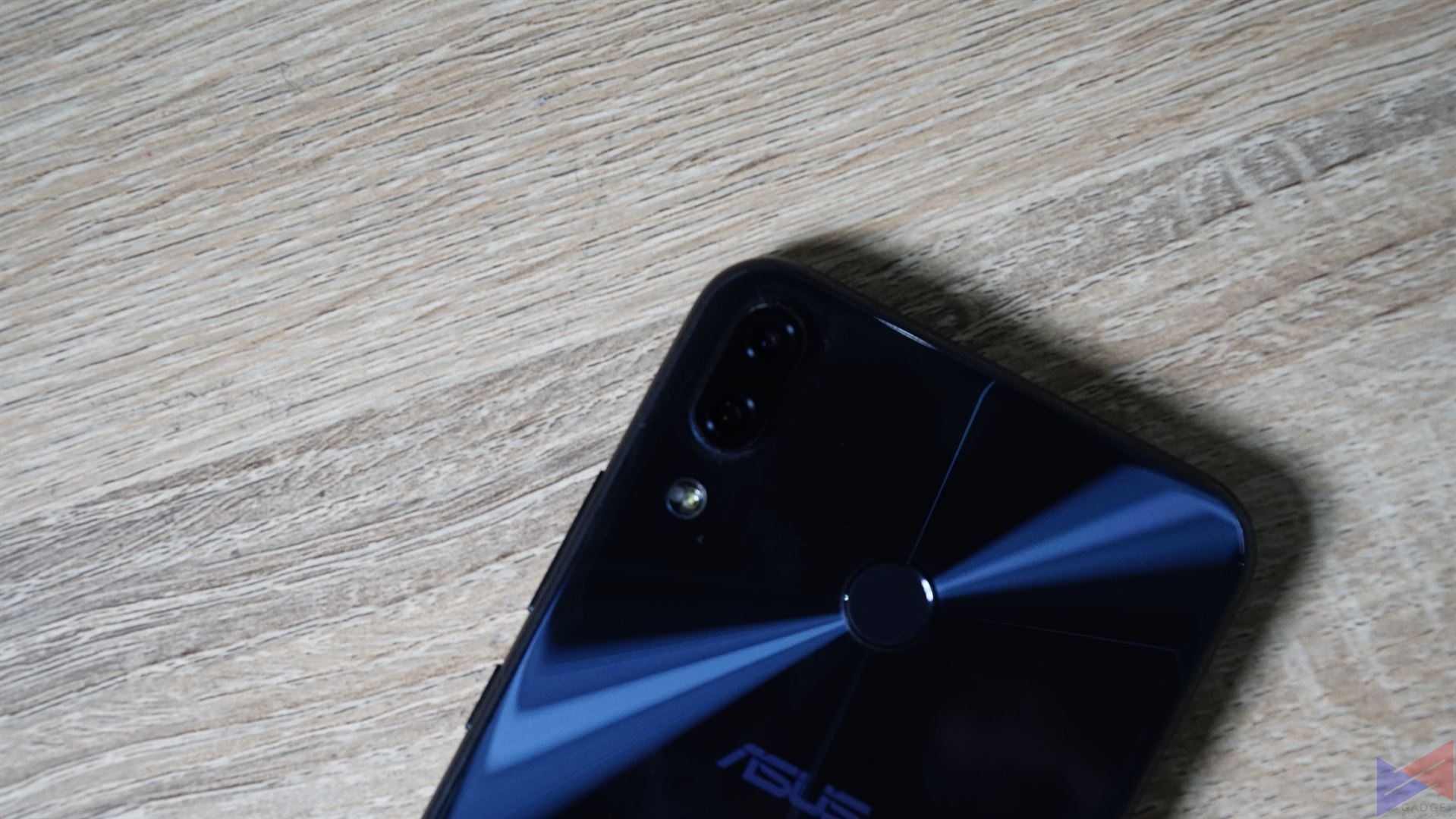
At the back is the expected dual camera module, which is positioned vertically, and slightly protrudes. The fingerprint sensor is now in a rounded shape. ASUS claims that this camera is capable of AI photography, that means it learns from its user to make itself perform better and more aligned with his or her preferences. We’ve yet to see whether it really works.

The thing I like the most? they got rid of that sticker at the back, that had the device’s information in it. As a result, the back of the phone now looks more seamless.
Sides
The buttons on the side really blend well with the design, they also feel clicky and responsive. The layout is also the same as the Zenfone 3, so there shouldn’t be any problems if you’re jumping from that model.
Initial Impressions
Overall, the Zenfone 5’s design is a big step up from its predecessor, and a sign that the company is moving with the times, and is again ready to compete with the other big boys. Stay tuned for our full review.
Emman has been writing technical and feature articles since 2010. Prior to this, he became one of the instructors at Asia Pacific College in 2008, and eventually landed a job as Business Analyst and Technical Writer at Integrated Open Source Solutions for almost 3 years.


